<transform-function>
CSS <transform-function> 자료형은 요소의 외형에 영향을 주는 변형을 나타냅니다. 변형 함수는 2D 또는 3D 공간 내에서 요소를 회전하고, 크기를 바꾸고, 왜곡하고, 이동할 수 있습니다. transform 속성에서 사용합니다.
변형을 수학적으로 표현하기
직교좌표계
직교좌표계 평면 위의 점은 X 좌표(가로 좌표)와 Y 좌표(세로 좌표)를 사용해 표현하며, 벡터 표현 (x, y)를 사용해 나타냅니다.
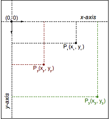
CSS (및 다른 대부분의 컴퓨터 그래픽)에서, 원점 (0, 0)은 요소의 좌상단 꼭짓점을 가리킵니다. 양의 좌표는 원점의 오른쪽과 아래로 진행하고, 음의 좌표는 왼쪽과 위로 진행합니다. 따라서 오른쪽으로 2단위, 아래쪽으로 5단위에 위치한 점은 (2, 5)이고 왼쪽으로 3단위, 위쪽으로 12단위 나아간 점은 (-3, -12)입니다.
변형 함수
Transformation functions alter the appearance of an element by manipulating the values of its coordinates. A linear transformation function is described using a 2×2 matrix, like this:
The function is applied to an element by using matrix multiplication. Thus, each coordinate changes based on the values in the matrix:
It is even possible to apply several transformations in a row:
With this notation, it is possible to describe, and therefore compose, most common transformations: rotations, scaling, or skewing. (In fact, all transformations that are linear functions can be described.) Composite transformations are effectively applied in order from right to left.
However, one major transformation is not linear, and therefore must be special-cased when using this notation: translation. The translation vector (tx, ty) must be expressed separately, as two additional parameters.
참고: Though trickier than Cartesian coordinates, homogeneous coordinates in projective geometry lead to 3×3 transformation matrices, and can simply express translations as linear functions.
구문
The <transform-function> data type is specified using one of the transformation functions listed below. Each function applies a geometric operation in either 2D or 3D.
행렬 변형
matrix()-
Describes a homogeneous 2D transformation matrix.
matrix3d()(en-US)-
Describes a 3D transformation as a 4×4 homogeneous matrix.
원근
perspective()(en-US)-
Sets the distance between the user and the z=0 plane.
회전
rotate()(en-US)-
Rotates an element around a fixed point on the 2D plane.
rotate3d()(en-US)-
Rotates an element around a fixed axis in 3D space.
rotateX()(en-US)-
Rotates an element around the horizontal axis.
rotateY()(en-US)-
Rotates an element around the vertical axis.
rotateZ()(en-US)-
Rotates an element around the z-axis.
크기 조절
scale()(en-US)-
Scales an element up or down on the 2D plane.
scale3d()(en-US)-
Scales an element up or down in 3D space.
scaleX()-
Scales an element up or down horizontally.
scaleY()(en-US)-
Scales an element up or down vertically.
scaleZ()(en-US)-
Scales an element up or down along the z-axis.
기울이기 (왜곡)
skew()(en-US)-
Skews an element on the 2D plane.
skewX()(en-US)-
Skews an element in the horizontal direction.
skewY()(en-US)-
Skews an element in the vertical direction.
이동
translate()-
Translates an element on the 2D plane.
translate3d()(en-US)-
Translates an element in 3D space.
translateX()(en-US)-
Translates an element horizontally.
translateY()(en-US)-
Translates an element vertically.
translateZ()(en-US)-
Translates an element along the z-axis.
명세
| Specification |
|---|
| CSS Transforms Module Level 1 # transform-functions |
| CSS Transforms Module Level 2 # transform-functions |
브라우저 호환성
BCD tables only load in the browser
같이 보기
- CSS
transform속성