利用 CSS 网格布局实现常用布局
为了完善这组 CSS 网格布局指南,我将介绍几种不同的布局,它们演示了在使用网格布局进行设计时可以使用的一些不同技术。我们将看到一个使用 grid-template-areas 的示例,一个典型的 12 列灵活网格系统,以及一个使用自动布局的产品列表。正如你从这组示例中看到的,使用网格布局通常有不止一种方法来实现你想要的结果。选择对你正在解决的问题和需要实现的设计最有帮助的方法。
使用网格模板区域的响应式布局,包含 1 到 3 个流动列
许多网站都是这种布局的变体,有内容、边栏、页眉和页脚。在响应式设计中,你可能希望将布局显示为单个列,在某个断点添加侧栏,然后为更宽的屏幕引入三列布局。
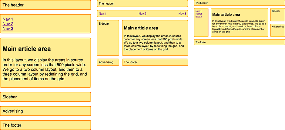
我将使用我们在向导网格模板区域中了解到的命名模板区域来创建这个布局。
我的标记是一个容器,其中包含用于标题、页脚、主要内容、导航、边栏和打算放置广告的块的元素。
<div class="wrapper">
  <header class="main-head">The header</header>
  <nav class="main-nav">
    <ul>
      <li><a href="">Nav 1</a></li>
      <li><a href="">Nav 2</a></li>
      <li><a href="">Nav 3</a></li>
    </ul>
  </nav>
  <article class="content">
    <h1>Main article area</h1>
    <p>
      In this layout, we display the areas in source order for any screen less
      that 500 pixels wide. We go to a two column layout, and then to a three
      column layout by redefining the grid, and the placement of items on the
      grid.
    </p>
  </article>
  <aside class="side">Sidebar</aside>
  <div class="ad">Advertising</div>
  <footer class="main-footer">The footer</footer>
</div>
因为我们使用grid-template-areas来创建布局。在任何媒体查询之外,我需要命名区域。我们使用grid-area 属性命名区域。
.main-head {
  grid-area: header;
}
.content {
  grid-area: content;
}
.main-nav {
  grid-area: nav;
}
.side {
  grid-area: sidebar;
}
.ad {
  grid-area: ad;
}
.main-footer {
  grid-area: footer;
}
这不会创建任何布局,但是我们的项目现在有了名称,我们可以使用它来创建布局。在任何媒体查询之外,我现在要为移动宽度设置布局。在这里,我保持源文件的顺序,试图避免源文件和显示之间的任何断开,就像向导网格布局和无障碍中描述的那样。我没有定义任何列或行跟踪,但是这种布局规定了单个列,并且将根据需要为隐式网格中的每个项目创建行。
.wrapper {
  display: grid;
  grid-gap: 20px;
  grid-template-areas:
    "header"
    "nav"
    "content"
    "sidebar"
    "ad"
    "footer";
}
在设置了移动布局之后,我们将获得所有屏幕大小的这一列,现在我们可以添加一个媒体查询并重新定义布局,以满足屏幕空间足够显示两列的情况。
@media (min-width: 500px) {
  .wrapper {
    grid-template-columns: 1fr 3fr;
    grid-template-areas:
      "header  header"
      "nav     nav"
      "sidebar content"
      "ad      footer";
  }
  nav ul {
    display: flex;
    justify-content: space-between;
  }
}
你可以看到布局在grid-template-areas的值中成形。 header 跨越两个列轨道,就像 nav 一样。在第三行轨道中,我们在 content 旁边有 sidebar 。在第四行轨道,我选择了放置我的广告内容 - 所以它出现在侧边栏下,然后 footer 旁边的内容。我在导航栏上使用了一个 flexbox 来显示它。
现在我可以添加最后一个断点来移动到三列布局。
@media (min-width: 700px) {
  .wrapper {
    grid-template-columns: 1fr 4fr 1fr;
    grid-template-areas:
      "header header  header"
      "nav    content sidebar"
      "nav    content ad"
      "footer footer  footer";
  }
  nav ul {
    flex-direction: column;
  }
}
三列布局有两个 1fr 单元侧列和一个中间列,轨道大小为 4fr。这意味着容器中的可用空间被划分为 6 个部分,并按照我们的三个轨道的比例分配—每个轨道的一个部分位于侧列,四个部分位于中心。
在这个布局中,我在左边的列中显示导航,旁边是内容。在右边栏我们有侧边栏,在它下面是广告。页脚现在横跨布局的底部。然后我使用一个 flex xbox 将导航显示为一个列。
这是一个简单的示例,但是演示了如何使用网格布局来为不同的断点重新安排布局。具体来说,我正在更改广告块的位置,这在不同的列设置中是合适的。我发现这种命名区域的方法在原型制作阶段非常有用,很容易处理元素的位置。你可以始终以这种方式开始使用 grid 进行原型设计,即使由于访问你站点的浏览器的原因,你不能在生产中完全依赖它。
灵活的 12 列布局
如果你使用过许多框架或网格系统之一,那么你可能已经习惯了将站点布置在 12 或 16 列的灵活网格上。我们可以使用 CSS 网格布局创建这种类型的系统。作为一个简单的例子,我正在创建一个 12 列的灵活网格,它有 12 个 1fr-unit 列轨道,它们都有一个名为col-start 的起始行。这意味着我们将拥有 12 条名为 col-start 的网格线。
.wrapper {
  display: grid;
  grid-template-columns: repeat(12, [col-start] 1fr);
  grid-gap: 20px;
}
为了演示这个网格系统是如何工作的,我在包装器中包含了 4 个子元素。
<div class="wrapper">
  <div class="item1">Start column line 1, span 3 column tracks.</div>
  <div class="item2">
    Start column line 6, span 4 column tracks. 2 row tracks.
  </div>
  <div class="item3">Start row 2 column line 2, span 2 column tracks.</div>
  <div class="item4">
    Start at column line 3, span to the end of the grid (-1).
  </div>
</div>
然后,我可以使用命名行和 span 关键字将它们放到网格上。
.item1 {
  grid-column: col-start / span 3;
}
.item2 {
  grid-column: col-start 6 / span 4;
  grid-row: 1 / 3;
}
.item3 {
  grid-column: col-start 2 / span 2;
  grid-row: 2;
}
.item4 {
  grid-column: col-start 3 / -1;
  grid-row: 3;
}
正如命名行指南中所述,我们使用命名行来放置项目。因为我们有 12 行名称相同,所以我们使用名称,然后是行索引。如果你喜欢并完全避免使用命名行,也可以使用行索引本身。
我没有设置结束行号,而是选择使用 span 关键字表示这个元素应该跨多少个轨道。我喜欢这种方法,因为在使用多列布局系统时,我们通常根据网格的轨迹数量来考虑块,并根据不同的断点进行调整。要查看块如何与轨道对齐,请使用 Firefox Grid Inspector (en-US). 。它清楚地展示了我们的项目是如何放置的。
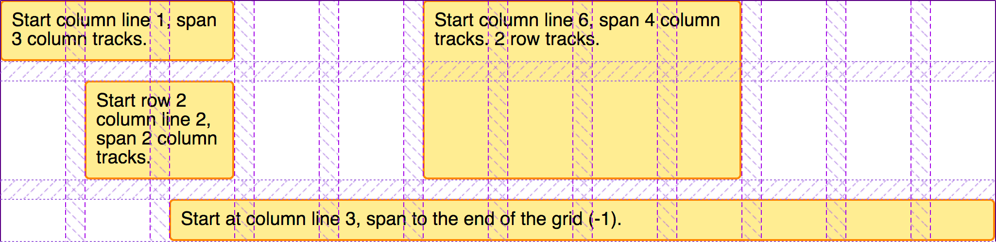
与你以前可能使用过的网格系统上的网格布局的工作方式有一些关键区别。如你所见,我们不需要添加任何标记来创建行,网格系统需要这样做来阻止元素弹出到上面的行中。使用 CSS 网格布局,我们可以将内容放入行中,如果行是空的,则它们不会上升到上面的行中。由于这种严格的列和行布局,我们也可以很容易地在布局中留出空白。我们也不需要特殊的类来拉或推东西,将它们缩进网格。我们需要做的就是指定项目的开始和结束行。
使用 12 列系统构建布局
为了了解这种布局方法在实践中是如何工作的,我们可以使用 12 列网格系统创建与使用grid-template-areas创建的布局相同的布局。我开始使用与网格模板区域示例相同的标记。
<div class="wrapper">
  <header class="main-head">The header</header>
  <nav class="main-nav">
    <ul>
      <li><a href="">Nav 1</a></li>
      <li><a href="">Nav 2</a></li>
      <li><a href="">Nav 3</a></li>
    </ul>
  </nav>
  <article class="content">
    <h1>Main article area</h1>
    <p>
      In this layout, we display the areas in source order for any screen less
      that 500 pixels wide. We go to a two column layout, and then to a three
      column layout by redefining the grid, and the placement of items on the
      grid.
    </p>
  </article>
  <aside class="side">Sidebar</aside>
  <div class="ad">Advertising</div>
  <footer class="main-footer">The footer</footer>
</div>
然后,我可以设置网格,如上面的示例 12 列布局。
.wrapper {
  display: grid;
  grid-template-columns: repeat(12, [col-start] 1fr);
  grid-gap: 20px;
}
我们将再次使其成为响应式布局,不过这次使用的是命名行。每个断点都将使用一个 12 列的网格,但是,根据屏幕的大小,项目将跨越的轨道数量会发生变化。
我们首先启动移动设备,对于最窄的屏幕,我们想要的只是保持项目的源顺序,并且所有项目都跨越网格。
.wrapper > * {
  grid-column: col-start / span 12;
}
在下一个断点处,我们希望转移到两列布局。我们的标题和导航仍然跨整个网格,所以我们不需要为它们指定任何位置。侧边栏从第一行 colstart 开始,共 3 行。它在第 3 行之后,因为标题和导航位于前两行轨道中。
ad 面板位于边栏下面,因此从网格行 4 开始。然后我们有内容和页脚,从 colstart 4 开始,跨越 9 个轨道,把它们带到网格的末端。
@media (min-width: 500px) {
  .side {
    grid-column: col-start / span 3;
    grid-row: 3;
  }
  .ad {
    grid-column: col-start / span 3;
    grid-row: 4;
  }
  .content,
  .main-footer {
    grid-column: col-start 4 / span 9;
  }
  nav ul {
    display: flex;
    justify-content: space-between;
  }
}
最后,我们转到这个布局的三列版本。标题继续横跨整个网格,但现在导航将向下移动,成为第一个侧边栏,其中包含内容,然后是旁边的侧边栏。页脚现在也跨整个布局。
@media (min-width: 700px) {
  .main-nav {
    grid-column: col-start / span 2;
    grid-row: 2 / 4;
  }
  .content {
    grid-column: col-start 3 / span 8;
    grid-row: 2 / 4;
  }
  .side {
    grid-column: col-start 11 / span 2;
    grid-row: 2;
  }
  .ad {
    grid-column: col-start 11 / span 2;
    grid-row: 3;
  }
  .main-footer {
    grid-column: col-start / span 12;
  }
  nav ul {
    flex-direction: column;
  }
}
网格检查器再次帮助我们了解布局是如何形成的。
在创建这个布局时需要注意的一点是,我们不需要在每个断点显式地定位网格上的每个元素。我们能够继承为早期断点设置的位置——这是移动优先”的优势。我们还可以利用网格自动布局。通过保持元素的逻辑顺序,自动布局为我们将项目放到网格上做了很多工作。在本指南的最后一个示例中,我们将创建完全依赖自动布局的布局。
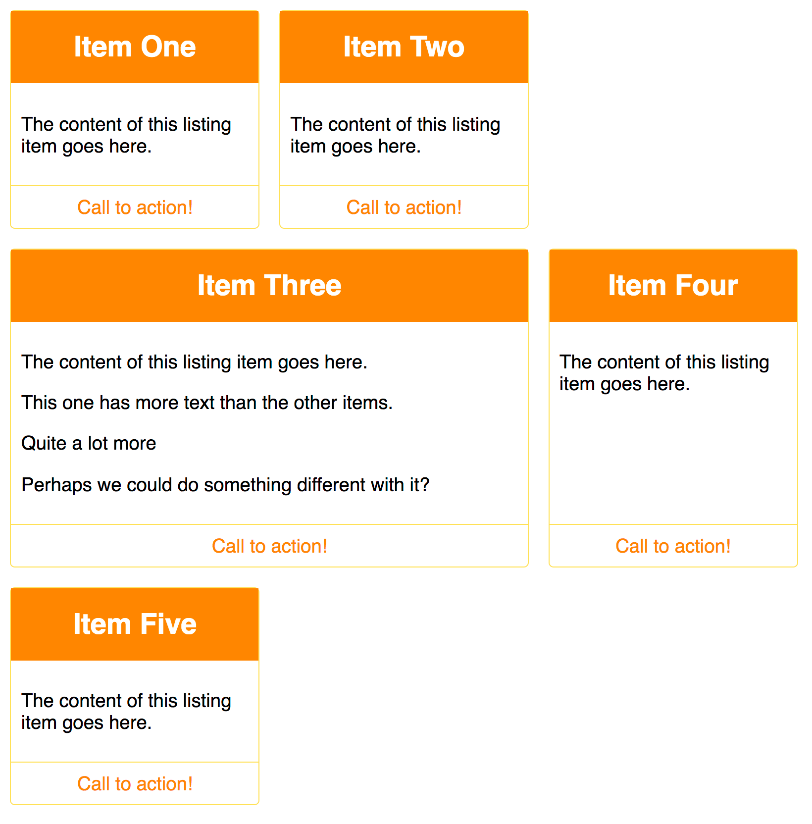
自动放置的产品列表
许多布局基本上是一组“卡片”——产品列表、图像库等等。网格可以使创建这些清单变得非常容易,而且无需添加媒体查询就可以响应。在下一个例子中,我将 CSS Grid 和 flexbox 布局相结合,以创建一个简单的产品列表布局。
我的列表的标记是一个无序的项目列表。每个项目都包含一个标题、一些不同高度的文本和对 action 链接的调用。
<ul class="listing">
  <li>
    <h2>Item One</h2>
    <div class="body"><p>The content of this listing item goes here.</p></div>
    <div class="cta"><a href="">Call to action!</a></div>
  </li>
  <li>
    <h2>Item Two</h2>
    <div class="body"><p>The content of this listing item goes here.</p></div>
    <div class="cta"><a href="">Call to action!</a></div>
  </li>
  <li class="wide">
    <h2>Item Three</h2>
    <div class="body">
      <p>The content of this listing item goes here.</p>
      <p>This one has more text than the other items.</p>
      <p>Quite a lot more</p>
      <p>Perhaps we could do something different with it?</p>
    </div>
    <div class="cta"><a href="">Call to action!</a></div>
  </li>
  <li>
    <h2>Item Four</h2>
    <div class="body"><p>The content of this listing item goes here.</p></div>
    <div class="cta"><a href="">Call to action!</a></div>
  </li>
  <li>
    <h2>Item Five</h2>
    <div class="body"><p>The content of this listing item goes here.</p></div>
    <div class="cta"><a href="">Call to action!</a></div>
  </li>
</ul>
我们将创建一个具有灵活数量的灵活列的网格。我希望它们永远不要小于 200 像素,然后平等地共享任何可用的剩余空间——所以我们总是得到相同宽度的列轨迹。我们使用 minmax() 函数实现了这一点,该函数是用于轨道大小的重复表示法。
.listing {
  list-style: none;
  margin: 2em;
  display: grid;
  grid-gap: 20px;
  grid-template-columns: repeat(auto-fill, minmax(200px, 1fr));
}
一旦我添加了这个 CSS,项目就开始以网格的形式展开。如果我让窗口变小或变宽,列跟踪的数量就会发生变化,而不需要使用媒体查询添加断点并重新定义网格。
然后,我就可以使用 flex touch 来整理这些盒子的内部结构。我将列表项设置为 display: flex 和 flex-direction 设置为 column。然后,我可以在 .cta 上使用自动边界将这个工具条推到盒子底部。
.listing li {
  border: 1px solid #ffe066;
  border-radius: 5px;
  display: flex;
  flex-direction: column;
}
.listing .cta {
  margin-top: auto;
  border-top: 1px solid #ffe066;
  padding: 10px;
  text-align: center;
}
.listing .body {
  padding: 10px;
}
这是我使用 flexbox 而不是 grid 的一个关键原因,如果我只是在一个维度上调整或发布一些东西,那就是一个 flexbox 用例。
使用 dense 关键字避免间隙
这一切现在看起来相当完整,然而我们有时拥有这些卡片,其中包含的内容比其他卡片多得多。让它们跨越两条轨道可能很好,这样它们就不会那么高了。我在较大的项目上有一个 wide 类,我添加了一个规则grid-column-end (en-US),其值为 span 2。现在,当 grid 遇到这个项目时,它将为它分配两个轨道。在某些断点处,这意味着我们将在网格中得到一个缺口——在这个缺口中没有空间放置一个双轨项目。
我可以通过设置grid-auto-flow: dense 在网格容器上设置稠密,从而使网格填充这些空白。但是,在这样做时要小心,因为它会使项目偏离其逻辑源顺序。你应该只在项目没有设置顺序时才这样做——并且要注意源文件后面的选项卡顺序的问题,而不是重新排序的显示。
.listing {
  list-style: none;
  margin: 2em;
  display: grid;
  grid-gap: 20px;
  grid-auto-flow: dense;
  grid-template-columns: repeat(auto-fill, minmax(200px, 1fr));
}
.listing .wide {
  grid-column-end: span 2;
}
这种技术使用 auto-placement 一些规则应用于某些物品是非常有用的,并且可以帮助你处理的内容是由 CMS 例如,输出有重复项,或许可以添加一个类特定的呈现为 HTML。
Further exploration
学习使用网格布局的最佳方法是继续构建我们在这里介绍的示例。选择一些你通常使用选择的框架构建的东西,或者使用浮动构建的东西,看看是否可以使用 grid 构建它。不要忘记寻找用当前方法无法构建的示例。这可能意味着从杂志或其他非网络资源中获取灵感。网格布局提供了我们以前没有过的可能性,我们不需要绑定到相同的旧布局来使用它。
- 有关灵感,请参阅 Layout Labs from Jen Simmons, 她一直在创建基于一系列资源的布局。
- 有关其他常见布局模式,请参见 Grid by Example, 这里有许多网格布局的小例子,也有一些较大的 UI 模式和完整的页面布局。