Column layouts
Baseline Widely available
This feature is well established and works across many devices and browser versions. It’s been available across browsers since September 2020.
你可能经常需要创建一个包含几个栏目的布局,css 提供了几个方法来实现它。使用 Grid, Flexbox 或者 Multi-column layout 都取决于你想要实现什么目标,在这篇 recipe 中我们会探讨这些内容
Requirements
你也许会为你的栏目实现多种设计样式:
- 连续的内容线,分成报纸式的专栏
- 被划分成几个高度相等的栏目的一行
- 按行和列排列的多行列
The recipes
为了达到你的需要你需要选择不同的布局方式
A continuous thread of content — multi-column layout
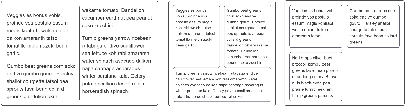
If you create columns using multi-column layout your text will remain as a continuous stream filling each column in turn. The columns must all be the same size, and you are unable to target an individual column or the content of an individual column.
如果你使用多列布局来创建列,则文本会以连续流的形式依次填满每个列。这些列必须大小相同,并且你不能够针对单个列或者单个列的内容
You can control the gaps between columns with the column-gap property, and add a rule between columns using column-rule.
你可以使用column-gap 控制列之间的距离,并且使用column-rule.增加列之间的规则
在以下情况使用多列布局:
- 你想要你的文本看起来想报纸那种排版布局。
- 你有一组要分成列的小项目。
- 你不需要单独为指定的列写样式。
A single row of items with equal heights — flexbox
Flexbox can be used to break content into columns by setting flex-direction to row, however flexbox targets the elements inside the flex container and will place each direct child into a new column. This is a different behavior to what you saw with multicol.
Flexbox 通过设置 row 的flex-direction ,可以用于将内容分成列,然而,flexbox 的目标是 flex 容器内的元素,并将把每个直接的子元素放到一个新列中,这是与 multicol 不同的地方。
There is currently no way to add a rule between flex items, and browser support for the column-gap and row-gap properties is limited. Therefore to create gaps between items use a margin.
目前没有办法可以在 flex 的 item 中添加规则,而且浏览器对column-gap 和 row-gap的支持是有限的,因此使用 margin 属性来创建 item 之间的间距
Flexbox can also be used to create layouts where the flex items wrap onto new rows, by setting the flex-wrap property on the container to wrap. These new flex lines will distribute space along that line only — the items in the new line will not line up with items in the line above, as you'll see in the example below. This is why flexbox is described as one-dimensional. It is designed for controlling layout as a row or a column, but not both at the same time.
Flexbox 还可以被用来创建 flex items 自动换行的布局,通过给 flex container 设置 flex-wrap 属性为 wrap. 这些新的 flex 行只会沿该行分配空间——新行中的项不会与上面行中的项对齐,你可以在下面的例子中看到。这就是为什么 flexbox 被描述为一维。他是为了将布局控制为行或列,但不是同时控制行和列。
Use flexbox:
- For single rows or columns of items. 设置一行或者一列中的 items
- When you want to do alignment on the cross axis after laying out your items. 当你想在横轴上对齐你的 items
- When you are happy for wrapped items to share out space along their line only and not line up with items in other lines.
Lining items up in rows and columns — grid layout
If what you want is a layout where items line up in rows and columns then you should choose CSS Grid Layout. Grid Layout works on the direct children of the grid container in a similar way to the manner in which flexbox works on the direct children of the flex container, however with CSS Grid you can line your items up in rows and columns — it is described as two-dimensional.
如果你想要 items 在行和列进行布局,你应该选择 Grid Layout. Grid Layout 作用于 grid container 的 直接子元素类似于 flexbox。但是你可以在行和列两方面来控制他(flex 只能在行或者列)。
Use Grid:
- For multiple rows or columns of items.
- When you want to be able to align the items on the block and inline axes.
- When you want items to line up in rows and columns.
浏览器兼容性
BCD tables only load in the browser