border-top-left-radius
概要
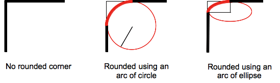
border-top-left-radius 用来设置元素左上角的圆角效果。这段圆弧(角)可以是圆或椭圆的一部分。如果其中有一个值为 0,那么将无圆角效果(见 border-top-left-radius 取值方式)。
盒模型的背景,可以是一张图片或一种颜色,会在边框处被剪裁,更甚至可以是一个圆;剪切的额外定位通过另一个 CSS 属性"background-clip"来定义。
备注: 在 border-top-left-radius 属性值之后,如果作用的元素上没有设置“border-radius”属性,那么这个属性值就会通过简写属性重新设置成它的初始值。
语法
css
/* the corner is a circle */
/* border-top-left-radius: radius */
border-top-left-radius: 3px;

/* the corner is an ellipsis */
/* border-top-left-radius: horizontal vertical */
border-top-left-radius: 0.5em 1em;

border-top-left-radius: inherit;
属性值:
- radius
-
可以是
<length>或者<percentage>,表示左上角边框的圆角半径。 - horizontal
-
可以是
<length>或者<percentage>,表示椭圆的水平半长轴在被用作边框左上角的半径。 - vertical
-
可以是
<length>或者<percentage>,表示椭圆的垂直半长轴在被用作边框左上角的半径。
取值
<length>-
<length>定义圆形半径或椭圆的半长轴,半短轴。不能用负值。 <percentage>-
使用百分数定义圆形半径或椭圆的半长轴,半短轴。水平半轴相对于盒模型的宽度;垂直半轴相对于盒模型的高度。不能用负值。
Formal syntax
border-top-left-radius =
  <length-percentage [0,∞]>{1,2}

<length-percentage> =
  <length>      |
  <percentage>
示例
| 实例 | 代码 |
|---|---|
| 椭圆的弧被用作左上角边框
css |
|
| 椭圆的弧被用作左上角边框
css |
|
| 盒子是方形的,圆弧被用作左上角边框
css |
|
| 盒子不是方形的,椭圆的弧被用作左上角边框
css |
|
| 背景色在左上角被剪切
css |
规范
| Specification |
|---|
| CSS Backgrounds and Borders Module Level 3 # the-border-radius |
浏览器兼容性
BCD tables only load in the browser
参见
- border-radius 相关 CSS 属性:
border-radius, 其他边角属性:border-top-right-radius,border-bottom-right-radius(en-US), andborder-bottom-left-radius.