Border images in CSS: A key focus area for Interop 2023
 Dipika Bhattacharya10 minute read
Interop 2023 is a cross-browser effort to improve the interoperability of the web — to reach a state where each technology works exactly the same in every browser. (Source: Interop 2023)
In Interop 2023, CSS border images were identified as a key focus area. This feature, which lets you use images for styling an element's border, has been supported in browsers for many years. However, behavioral differences across browsers (as highlighted in this web-platform issue) have led to some reluctance among web developers to fully use this feature. With the inclusion of border images in Interop 2023, there is a renewed commitment for resolving the behavioral differences and encouraging widespread adoption. This initiative highlights the importance of being able to create visually appealing web designs that are consistent across different browsers.
Each aspect of the border image can be controlled using a specific border-image CSS property, all of which are extensively explained on MDN's reference pages. In this post, we'll provide a recap of all the longhand properties associated with border images and explore how to customize images in borders.
Getting started with border images
Border images in CSS allow you to use custom images as borders around elements on your website, replacing the standard borders. How cool is that! This gives you a unique and powerful way to style and add your personal creative touch to your website. For instance, imagine you're running an online florist store. You could use a floral or a nature image as the border for various elements on your website to add a charming and uniform theme throughout.
Here's a summary of all the steps involved in successfully using an image as an element's border. The very first step involves specifying the source of the image you like. Following this, you slice the image to specify the parts to be used in the border. Next, you adjust the width (that is, the thickness) of the image, which will control how the image scales within the border area. You have the option to define an outset if you want the image to extend beyond the element's border. Finally, you decide how the image fits or repeats around the border. This will define whether the image repeats, stretches, or adjusts to fit the border area. By following these steps, you can effectively use a custom image as an element border in your web design.
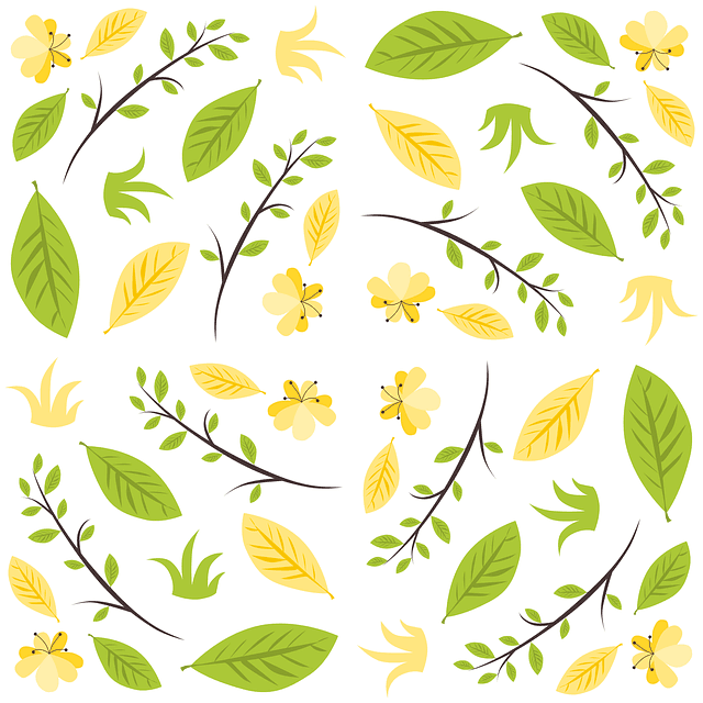
We'll use the following nature-themed image (courtesy of pixabay) to demonstrate how to use it as a border image.
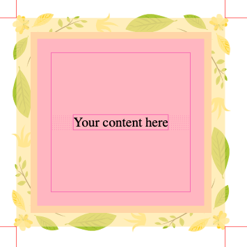
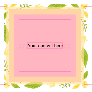
Also, for reference, the following box represents the element where we want to add that border image. The thick green border area is what we will replace with our image. The light yellow background color represents the content and padding boxes.
Specifying the image
You specify the source of the border image by using the border-image-source property. Similar to background-image, this property accepts either a URL to an image file or a gradient and applies it to the border of the box. You can use various image formats like PNG, JPG, or SVG.
.box {
  border: 30px solid transparent;
  border-image-source: url("https://developer.mozilla.org/en-US/blog/border-images-interop-2023/nature.png");
}
You'll notice at this stage that the image appears only in the corners of the box. Not what we were expecting, huh? This is just the first step and still a few steps away from customizing the look of the image in the border. The image needs to be further processed using other border-image property values to render the final border appearance — at this point, we're missing instructions on how to slice or distribute the image across the border.
You will notice in the code above that along with the border image, both border-width and border-style have been defined using the border shortcut property. This is because the border-image property will be visible only if the element has a defined border. The border-width property sets the available space for the border image, and the border-style property ensures that the border image is displayed correctly. Without border-width and border-style, the border image will not display, regardless of the border-image properties you set.
Slicing the image
Slicing helps us define the parts of the image that will be displayed in the corners and sides of the element's border. It's like cutting a cake into slices, where each piece has its place.
You can slice the image by using the border-image-slice property. This property slices the image using four imaginary lines that are at the specified slice distances from the respective edges. The four slice lines effectively divide the image into nine regions: four corners, four edges, and the middle. These lines determine the size of the regions of the image that will be used for the border.
As an example, with the slice value of 30 for all the sides, the sliced regions would look as shown in the right image below:
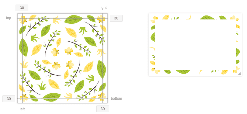
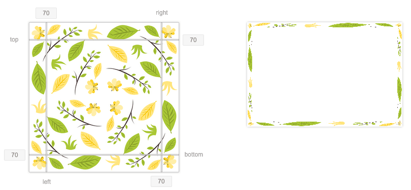
With this value 30, the sliced region shown above does not capture enough portion from the image, at least not the parts we would really like to show in the border. Most of the leaves and flowers are getting truncated. In the code below, let's use a higher value, say 70, for slicing the image and see how that looks.
.box {
  border: 30px solid transparent;
  border-image-source: url("https://developer.mozilla.org/en-US/blog/border-images-interop-2023/nature.png");
  border-image-slice: 70;
}
This is looking much better with more desirable regions of the image showing in the border. As you can make out, the result of this step will depend on the image you use. So definitely explore different settings for slicing. Note that it is the green border area we showed earlier that's getting replaced with our custom image.
There is another option you can specify with the border-image-slice value. By default, the slicing action discards the middle part of the image. If you want to preserve it though, you can add fill to the value, as in, border-image-slice: 70 fill;. This will draw the border image over the background in the middle region as well.
Adjusting the width
In the next step, let's decide on the thickness of the border image. This will determine how the border image scales within the border area. We set the width of the border image using the border-image-width property. It defines the inward offsets for the border image from the border edges.
You can see from the image below how setting a width of 10px would look. At this width, the image in the border is getting very stretched out.
Let's try increasing the width of the image to 30px.
.box {
  border: 30px solid transparent;
  border-image-source: url("https://developer.mozilla.org/en-US/blog/border-images-interop-2023/nature.png");
  border-image-slice: 70;
  border-image-width: 30px;
}
At this width, the border image is looking better scaled.
You might think that we arrived at this output at the end of the slicing section as well. So how did adding a border-image-width help? The output looks the same because when the border-image-width property is not specified, which was the case in the slicing section, the browser uses the initial value, which is 1. This means that the width of the border image will be equal to the intrinsic width or height (whichever is applicable) of the corresponding border-image-slice. If the image does not have the required intrinsic dimension, the corresponding border-width is used instead.
Let's also take a moment here to make sure we understand the purpose of the border-image-width and border-width properties. While the border-image-width property defines how wide or thick the border image will appear, the border-width property defines the width of the border around the element. So border-image-width determines how the border image is scaled within this allocated border area. Consider these scenarios:
- If
border-image-widthis greater thanborder-width, the border image will extend beyond the padding and maybe even the content box edge. - If
border-image-widthis smaller thanborder-width, the image may not fill the entire border area. However, the image may appear distorted or scaled down because it's being squeezed into a smaller space.
Extending the image beyond the border
Sometimes, you might want your border image to extend beyond the element's border box, almost like adding more depth to the design. It's like deciding how much the icing on a cake should overflow. This is where the border-image-outset property comes into play. Although the order of specifying properties is not strict, but border-image-outset is typically specified after the border-image-width property.
Here's a side-by-side comparison of outset values 10px (on the left) and 20px (on the right). The border in these images has been highlighted (using the Box Model section in the browser's inspector tool) to demonstrate the extension of the border image outside the border area.
Continuing on with our example, let's use a value of 10px for border-image-outset.
.box {
  border-width: 30px; /* Width of the border area */
  border-style: solid;
  border-image-source: url("https://developer.mozilla.org/en-US/blog/border-images-interop-2023/nature.png");
  border-image-slice: 70;
  border-image-width: 30px; /* Width of the border image */
  border-image-outset: 10px; /* Extension of the border image beyond the border area */
}
Based on the code above, the border image will be displayed with a width of 30px, which is within the border area of the element, defined by border-width. The border-image-outset value specifies that the border image will extend 10px outside the border box. This extension is in addition to the width specified by border-image-width. The total width occupied by the border and its outset will be 40px (30px for the border and an additional 10px for the outset).
A larger outset value can make the border appear as if it's floating around the element, while a smaller outset keeps the border image more contained.
Controlling the layout
We're now very close to getting to the final look of the image in the border. Because of the specific image we are using and the values we've specified for slicing and width, this element's border already resembles the final desired appearance. But there's another knob you have at your disposal for the final layout tweak. In this final step, you define how the sliced sections of the image are laid out around the border - that is, should they repeat, stretch, or adjust to fit the border area. The border-image-repeat property helps you with this. This property is often specified last among the border-image properties because it deals with the final layout of the border image in the element.
- To make the image repeat around the border in such a way that it fits perfectly without clipping, use the value
round. Image sections might be stretched for a proper fit. - To have extra space be added instead of the stretch for a proper fit, use the value
space. - To stretch the image to fill the border area without repeating the image, use the value
stretch. - The value
repeatwill repeat the image across the border, potentially clipping it if it doesn't fit perfectly in the border area.
You can even define different layout and scaling for horizontal (top and bottom) and vertical (left and right) sides by specifying two values for border-image-repeat. As an exercise, try to explore the differences in appearance between using the same value for all sides and different values for horizontal and vertical sides.
Let's use round in our example here to fit the image perfectly around the border.
.box {
  border: 30px solid transparent;
  border-image-source: url("https://developer.mozilla.org/en-US/blog/border-images-interop-2023/nature.png");
  border-image-slice: 70;
  border-image-width: 30px;
  border-image-outset: 10px;
  border-image-repeat: round;
}
And there you have it: a pretty image of our liking or one that matches the theme of our website, used as the border around an element that we can use in our website design.
Using the border-image shorthand property
We can set all these properties in one go using the shorthand border-image property.
The code below uses the shorthand border-image property to set multiple border image properties, including border-image-source, border-image-slice, border-image-width, border-image-outset, and border-image-repeat, at the same time. Any value you don't specify gets set as the property's initial value.
.box {
  border: 30px solid transparent;
  border-image: url("https://developer.mozilla.org/en-US/blog/border-images-interop-2023/nature.png")
    70 / 30px / 10px round;
}
Interop 2023 and beyond
As part of Interop 2023's focus on CSS border images, significant efforts are being made to enhance cross-browser compatibility and standardize the behavior. With the commitment from browser developers to achieve consistent border image behavior, we hope this post piques or renews your interest to explore border images in your future web projects.
This is an excellent time to explore the creative possibilities of this feature! We look forward to hearing your thoughts and ideas, and we'd be delighted to see what you create. Feel free to share with us on Mastodon or Discord.
Additional resources
To explore individual border-image properties interactively and check how they interplay with each other, check out the Border-image generator tool on MDN. You can upload any image and see the effect of various border-image properties.