Устранение проблем доступности
In the assessment for this module, we present to you a simple site with a number of accessibility issues that you need to diagnose and fix.
| Prerequisites: | Basic computer literacy, a basic understanding of HTML, CSS, and JavaScript, an understanding of the previous articles in the course. |
|---|---|
| Objective: | To test basic knowledge of accessibility fundamentals. |
Starting point
To get this assessment started, you should go and grab the ZIP containing the files that comprise the example. Decompress the contents into a new directory somewhere on your local computer.
The finished assessment site should look like so:
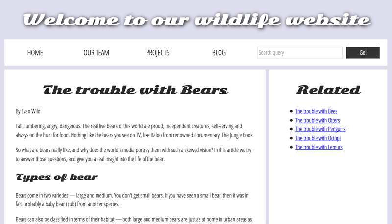
You will see some differences/issues with the display of the starting state of the assessment — this is mainly due to the differences in the markup, which in turn cause some styling issues as the CSS is not applied properly. Don't worry — you'll be fixing these problems in the upcoming sections!
Project brief
For this project, you are presented with a fictional nature site displaying a "factual" article about bears. As it stands, it has a number of accessibility issues — your task is to explore the existing site and fix them to the best of your abilities, answering the questions given below.
Color
The text is difficult to read because of the current color scheme. Can you do a test of the current color contrast (text/background), report the results of the test, and then fix it by changing the assigned colors?
Semantic HTML
- The content is still not very accessible — report on what happens when you try to navigate it using a screenreader.
- Can you update the article text to make it easier for screenreader users to navigate?
- The navigation menu part of the site (wrapped in
<div class="nav"></div>) could be made more accessible by putting it in a proper HTML5 semantic element. Which one should it be updated to? Make the update.
Примечание: You'll need to update the CSS rule selectors that style the tags to their proper equivalents for the semantic headings. Once you add paragraph elements, you'll notice the styling looking better.
The images
The images are currently inaccessible to screenreader users. Can you fix this?
The audio player
- The
<audio>player isn't accessible to hearing impaired (deaf) people — can you add some kind of accessible alternative for these users? - The
<audio>player isn't accessible to those using older browsers that don't support HTML5 audio. How can you allow them to still access the audio?
The forms
- The
<input>element in the search form at the top could do with a label, but we don't want to add a visible text label that would potentially spoil the design and isn't really needed by sighted users. How can you add a label that is only accessible to screenreaders? - The two
<input>elements in the comment form have visible text labels, but they are not unambiguously associated with their labels — how do you achieve this? Note that you'll need to update some of the CSS rule as well.
The show/hide comment control
The show/hide comment control button is not current keyboard-accessible. Can you make it keyboard accessible, both in terms of focusing it using the tab key, and activating it using the return key?
The table
The data table is not currently very accessible — it is hard for screenreader users to associate data rows and columns together, and the table also has no kind of summary to make it clear what it shows. Can you add some features to your HTML to fix this problem?
Other considerations?
Can you list two more ideas for improvements that would make the website more accessible?
Assessment
If you are following this assessment as part of an organized course, you should be able to give your work to your teacher/mentor for marking. If you are self-learning, then you can get the marking guide fairly easily by asking on the discussion thread for this exercise, or in the #mdn IRC channel on Mozilla IRC. Try the exercise first — there is nothing to be gained by cheating!