Pagination
This cookbook pattern demonstrates the navigation pattern used to display pagination, where the user can move between pages of content such as search results.
Requirements
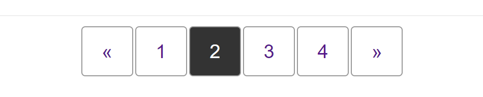
The pagination pattern typically displays items in a row. To ensure that the pagination is understandable by people using a screen reader, we mark the items up as a list inside a <nav> element, and then use CSS to display the layout visually as a row.
Typically, the pagination component will be centered horizontally underneath the content.
Recipe
Choices made
This pattern is laid out using flexbox — one flex container nested inside another. The <nav> element is designated a flex container in order that we can center the list inside using the justify-content property.
The list itself also becomes a flex container to lay the items out as a row. To space the items out we can either use a margin on the flex items or add a gap on the flex container.
.pagination {
  list-style: none;
  margin: 0;
  padding: 0;
  display: flex;
  gap: 2px;
}
Accessibility concerns
We want to ensure that a person using a screen reader understands what this navigation does, and where they will go when clicking a link. To help with this we have added aria-label="pagination" on the <nav> element.
We have also added some additional content that would be read by a screen reader but is hidden visually, and set the aria-hidden attribute on the paging arrows.
The "See Also" section at the end of this document has links to related accessibility topics.
Specifications
See also
justify-content,gap- Know your ARIA: 'hidden' vs 'none' (2018)
- Invisible content just for screen reader users via WebAIM.org (2020)
- Writing CSS with accessibility in mind (2017)
- a11y style guide: pagination