React ToDoリストをはじめる
例えば、React でアイディアを検証するためにアプリを試作してみることになったとします(いわゆる、Proof of Concept - 概念実証)。ユーザーが作業したいタスクを追加、編集、削除することができ、また、タスクを削除せずに完了とすることができるアプリです。この記事では、基本的な App コンポーネントの構造とスタイルを整え、後から追加する個々のコンポーネントの定義とインタラクティブな機能の準備を行っていきます。
メモ: コードを我々のバージョンと照らし合わせる必要がある場合は、我々の todo-react リポジトリからサンプルの React アプリコードの完成版を確認することができます。実際に動作しているアプリのバージョンについては、https://mdn.github.io/todo-react-build/ を参照してください。
| 前提条件: | HTML 、CSS 、JavaScript の基本的な知識を持っていること。また ターミナル/コマンドライン に関する知識を持っていること。 |
|---|---|
| 目的: | todo リストの実際の利用例を紹介し、基本的なアプリの構造とスタイルを整えていきます。 |
アプリの「ユーザーストーリー」
ソフトウェア開発においてユーザーストーリーとは、ユーザーの視点から見た実行可能な目標のことを指します。作業を始める前にユーザーストーリーを定義することで、作業に集中することができます。私たちのアプリは、次のようなストーリーを満たす必要があります:
ユーザーができること
- タスクのリストを読むこと
- マウスまたはキーボードを使用してタスクを追加すること
- マウスまたはキーボードを使用して、タスクに完了のマークを付けること
- マウスまたはキーボードを使用して、タスクを削除すること
- マウスまたはキーボードを使用して、タスクを編集すること
- タスクの特定の一部を表示する:すべてのタスク、アクティブなタスクのみ、完了したタスクのみ。
これらのストーリーに 1 つずつ取り組んでいきます。
プロジェクトに入る前に現状整理
create-react-app を用いた場合、今回のプロジェクトでは使用しないファイルがいくつか作られます。
- コンポーネントごとにスタイルシートを書く予定はないので、まず
App.jsの冒頭にあるApp.cssのインポートを削除してください。 logo.svgを使用する予定もないので、このインポートも削除してください。
次に、以下のコマンドをコピーしてターミナルに貼り付け、不要なファイルをいくつか削除します。アプリのルートディレクトリーから開始していることを確認してください。
# Move into the src directory of your project
cd src
# Delete a few files
rm -- App.test.js App.css logo.svg serviceWorker.js setupTests.js
# Move back up to the root of the project
cd ..
注意点:
- 今回削除するうちの 2 つのファイルは、アプリケーションのテスト用です。ここではテストについては説明しません。
- 上記のターミナルで作業を行うためにサーバーを停止した場合は、
npm startを使用してサーバーを再度起動する必要があります。
プロジェクトの出発地点のコード
このプロジェクトの出発地点として、次の 2 つを用意します。今あるものを置き換えた App() 関数と、アプリのスタイルを設定するための CSS です。
JSX
次のスニペットをクリップボードにコピーして App.js に貼り付け、既存の App() 関数を置き換えます。
function App(props) {
  return (
    <div className="todoapp stack-large">
      <h1>TodoMatic</h1>
      <form>
        <h2 className="label-wrapper">
          <label htmlFor="new-todo-input" className="label__lg">
            What needs to be done?
          </label>
        </h2>
        <input
          type="text"
          id="new-todo-input"
          className="input input__lg"
          name="text"
          autoComplete="off"
        />
        <button type="submit" className="btn btn__primary btn__lg">
          Add
        </button>
      </form>
      <div className="filters btn-group stack-exception">
        <button type="button" className="btn toggle-btn" aria-pressed="true">
          <span className="visually-hidden">Show </span>
          <span>all</span>
          <span className="visually-hidden"> tasks</span>
        </button>
        <button type="button" className="btn toggle-btn" aria-pressed="false">
          <span className="visually-hidden">Show </span>
          <span>Active</span>
          <span className="visually-hidden"> tasks</span>
        </button>
        <button type="button" className="btn toggle-btn" aria-pressed="false">
          <span className="visually-hidden">Show </span>
          <span>Completed</span>
          <span className="visually-hidden"> tasks</span>
        </button>
      </div>
      <h2 id="list-heading">3 tasks remaining</h2>
      <ul
        role="list"
        className="todo-list stack-large stack-exception"
        aria-labelledby="list-heading">
        <li className="todo stack-small">
          <div className="c-cb">
            <input id="todo-0" type="checkbox" defaultChecked={true} />
            <label className="todo-label" htmlFor="todo-0">
              Eat
            </label>
          </div>
          <div className="btn-group">
            <button type="button" className="btn">
              Edit <span className="visually-hidden">Eat</span>
            </button>
            <button type="button" className="btn btn__danger">
              Delete <span className="visually-hidden">Eat</span>
            </button>
          </div>
        </li>
        <li className="todo stack-small">
          <div className="c-cb">
            <input id="todo-1" type="checkbox" />
            <label className="todo-label" htmlFor="todo-1">
              Sleep
            </label>
          </div>
          <div className="btn-group">
            <button type="button" className="btn">
              Edit <span className="visually-hidden">Sleep</span>
            </button>
            <button type="button" className="btn btn__danger">
              Delete <span className="visually-hidden">Sleep</span>
            </button>
          </div>
        </li>
        <li className="todo stack-small">
          <div className="c-cb">
            <input id="todo-2" type="checkbox" />
            <label className="todo-label" htmlFor="todo-2">
              Repeat
            </label>
          </div>
          <div className="btn-group">
            <button type="button" className="btn">
              Edit <span className="visually-hidden">Repeat</span>
            </button>
            <button type="button" className="btn btn__danger">
              Delete <span className="visually-hidden">Repeat</span>
            </button>
          </div>
        </li>
      </ul>
    </div>
  );
}
次に public/index.html を開いて、<title>要素のテキストを TodoMatic に変更します。こうすることでアプリ上部の <h1> と一致します。
<title>TodoMatic</title>
ブラウザーを更新すると、次のように表示されます。
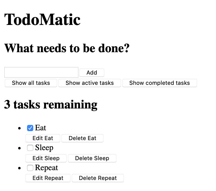
まだ見た目が整っていなくて、機能もしていませんが、一旦問題はありません。すぐにスタイルを設定します。まず現在の JSX と、それがユーザーストーリーにどのように対応しているかを考えてみます。
- 新しいタスクを書き込むための
<input type="text">要素と、フォームを送信するためのボタンを備えた<form>要素があります。 - タスクのフィルタリングに使用するためのボタンが並んでいます。
- 残っているタスクの数を示す見出しがあります。
- 3 つのタスクがあり、順序付けられていないリストとして配置されています。それぞれのタスクはリストアイテム(
<li>)であり、タスクを編集および削除するためのボタンと、完了したことをチェックするためのチェックボックスがあります。
フォームはタスクを作成するためのもので、ボタンはタスクをフィルタリングするためのもの、また見出しとリストはタスクを読むためのものです。今のところタスクを編集するための UI は分かりづらいですが、そちらについては後でコードを書き足していきます。
アクセシビリティ
ここでいくつかの珍しい属性に気付くかもしれません。例えば:
<button type="button" className="btn toggle-btn" aria-pressed="true">
  <span className="visually-hidden">Show </span>
  <span>all</span>
  <span className="visually-hidden"> tasks</span>
</button>
aria-pressed は支援技術(スクリーン・リーダーなど)に対して、ボタンが押された状態と押されていない状態の 2 つの状態のうちの 1 つであることを伝えます。これは on と off (あるいは pressed か unpressed )を切り替えるようなものだと考えてください。 true の値を設定すると、デフォルトでボタンが押された状態となります。
visually-hidden というクラスについては、CSS を記述していないので、まだ意味はありません。ただし、スタイルを設定すると、このクラスの要素はすべて目の見えるユーザーからは隠され、スクリーンリーダーのユーザーは引き続き使用できるようになります。これらの単語は、目の見えるユーザーには必要ありません。視覚的な文脈を持たないスクリーンリーダーのユーザーに、ボタンが何をするのかという情報を提供するためにあります。
さらに下には <ul> 要素があります:
<ul
  role="list"
  className="todo-list stack-large stack-exception"
  aria-labelledby="list-heading"></ul>
role属性は、タグがどのような要素を表しているのかを説明するのに役立ちます。 <ul> はデフォルトではリストのように扱われますが、これから追加するスタイルはその機能を壊します。この role 属性は、<ul> 要素に「リスト」であることを再度伝えます。なぜこれが必要な理由なのか詳しく知りたい方は、Scott O'Hara の記事「Fixing Lists」 をご覧ください。
aria-labelledby 属性は、リストの見出しをその下にあるリストの目的を説明するラベルとして扱っていることを支援技術に伝えます。この関連付けを行うことで、リストの情報がより豊富になり、スクリーンリーダーのユーザーがリストの目的をよりよく理解できるようになります。
最後に、リスト項目のラベルと入力には、JSX 特有の属性がいくつかあります。
<input id="todo-0" type="checkbox" defaultChecked="{true}" />
<label className="todo-label" htmlFor="todo-0"> Eat </label>
<input/ > タグの defaultChecked 属性は、React にこのチェックボックスを最初にチェックするように指示します。通常の HTML のように checked を使用した場合、React はチェックボックスのイベント処理に関連する警告をブラウザーコンソールに表示させます。今のところは気にしないで大丈夫です。後ほどイベントを使用するときにこれについては説明します。
また htmlFor 属性は、HTML で使用されている for 属性に対応しています。 JSX では for は予約語であるため、属性として使用できません。そのため React は for の代わりに htmlFor を使用します。
注意点:
- JSX の属性でブール値(
trueおよびfalse)を使用するには、それらを中括弧で囲む必要があります。もしdefaultChecked="true"と書いた場合、defaultCheckedの値は文字列リテラルである"true"になります。これは実際には HTML ではなく JavaScript であることを忘れないでください。 - 先ほどのコードで使われていた
aria-pressed属性は"true"でしたが、これはcheckedのようにブール値としての true とは扱われないためです。
スタイルを実装する
次の CSS コードを src/index.css に貼り付けて、現在のコードを置き換えてください。
/* RESETS */
*,
*::before,
*::after {
  box-sizing: border-box;
}
*:focus {
  outline: 3px dashed #228bec;
  outline-offset: 0;
}
html {
  font: 62.5% / 1.15 sans-serif;
}
h1,
h2 {
  margin-bottom: 0;
}
ul {
  list-style: none;
  padding: 0;
}
button {
  border: none;
  margin: 0;
  padding: 0;
  width: auto;
  overflow: visible;
  background: transparent;
  color: inherit;
  font: inherit;
  line-height: normal;
  -webkit-font-smoothing: inherit;
  -moz-osx-font-smoothing: inherit;
  -webkit-appearance: none;
}
button::-moz-focus-inner {
  border: 0;
}
button,
input,
optgroup,
select,
textarea {
  font-family: inherit;
  font-size: 100%;
  line-height: 1.15;
  margin: 0;
}
button,
input {
  overflow: visible;
}
input[type="text"] {
  border-radius: 0;
}
body {
  width: 100%;
  max-width: 68rem;
  margin: 0 auto;
  font:
    1.6rem/1.25 Arial,
    sans-serif;
  background-color: #f5f5f5;
  color: #4d4d4d;
}
@media screen and (min-width: 620px) {
  body {
    font-size: 1.9rem;
    line-height: 1.31579;
  }
}
/*END RESETS*/
/* GLOBAL STYLES */
.form-group > input[type="text"] {
  display: inline-block;
  margin-top: 0.4rem;
}
.btn {
  padding: 0.8rem 1rem 0.7rem;
  border: 0.2rem solid #4d4d4d;
  cursor: pointer;
  text-transform: capitalize;
}
.btn.toggle-btn {
  border-width: 1px;
  border-color: #d3d3d3;
}
.btn.toggle-btn[aria-pressed="true"] {
  text-decoration: underline;
  border-color: #4d4d4d;
}
.btn__danger {
  color: #fff;
  background-color: #ca3c3c;
  border-color: #bd2130;
}
.btn__filter {
  border-color: lightgrey;
}
.btn__primary {
  color: #fff;
  background-color: #000;
}
.btn-group {
  display: flex;
  justify-content: space-between;
}
.btn-group > * {
  flex: 1 1 49%;
}
.btn-group > * + * {
  margin-left: 0.8rem;
}
.label-wrapper {
  margin: 0;
  flex: 0 0 100%;
  text-align: center;
}
.visually-hidden {
  position: absolute !important;
  height: 1px;
  width: 1px;
  overflow: hidden;
  clip: rect(1px 1px 1px 1px);
  clip: rect(1px, 1px, 1px, 1px);
  white-space: nowrap;
}
[class*="stack"] > * {
  margin-top: 0;
  margin-bottom: 0;
}
.stack-small > * + * {
  margin-top: 1.25rem;
}
.stack-large > * + * {
  margin-top: 2.5rem;
}
@media screen and (min-width: 550px) {
  .stack-small > * + * {
    margin-top: 1.4rem;
  }
  .stack-large > * + * {
    margin-top: 2.8rem;
  }
}
.stack-exception {
  margin-top: 1.2rem;
}
/* END GLOBAL STYLES */
.todoapp {
  background: #fff;
  margin: 2rem 0 4rem 0;
  padding: 1rem;
  position: relative;
  box-shadow:
    0 2px 4px 0 rgba(0, 0, 0, 0.2),
    0 2.5rem 5rem 0 rgba(0, 0, 0, 0.1);
}
@media screen and (min-width: 550px) {
  .todoapp {
    padding: 4rem;
  }
}
.todoapp > * {
  max-width: 50rem;
  margin-left: auto;
  margin-right: auto;
}
.todoapp > form {
  max-width: 100%;
}
.todoapp > h1 {
  display: block;
  max-width: 100%;
  text-align: center;
  margin: 0;
  margin-bottom: 1rem;
}
.label__lg {
  line-height: 1.01567;
  font-weight: 300;
  padding: 0.8rem;
  margin-bottom: 1rem;
  text-align: center;
}
.input__lg {
  padding: 2rem;
  border: 2px solid #000;
}
.input__lg:focus {
  border-color: #4d4d4d;
  box-shadow: inset 0 0 0 2px;
}
[class*="__lg"] {
  display: inline-block;
  width: 100%;
  font-size: 1.9rem;
}
[class*="__lg"]:not(:last-child) {
  margin-bottom: 1rem;
}
@media screen and (min-width: 620px) {
  [class*="__lg"] {
    font-size: 2.4rem;
  }
}
.filters {
  width: 100%;
  margin: unset auto;
}
/* Todo item styles */
.todo {
  display: flex;
  flex-direction: row;
  flex-wrap: wrap;
}
.todo > * {
  flex: 0 0 100%;
}
.todo-text {
  width: 100%;
  min-height: 4.4rem;
  padding: 0.4rem 0.8rem;
  border: 2px solid #565656;
}
.todo-text:focus {
  box-shadow: inset 0 0 0 2px;
}
/* CHECKBOX STYLES */
.c-cb {
  box-sizing: border-box;
  font-family: Arial, sans-serif;
  -webkit-font-smoothing: antialiased;
  font-weight: 400;
  font-size: 1.6rem;
  line-height: 1.25;
  display: block;
  position: relative;
  min-height: 44px;
  padding-left: 40px;
  clear: left;
}
.c-cb > label::before,
.c-cb > input[type="checkbox"] {
  box-sizing: border-box;
  top: -2px;
  left: -2px;
  width: 44px;
  height: 44px;
}
.c-cb > input[type="checkbox"] {
  -webkit-font-smoothing: antialiased;
  cursor: pointer;
  position: absolute;
  z-index: 1;
  margin: 0;
  opacity: 0;
}
.c-cb > label {
  font-size: inherit;
  font-family: inherit;
  line-height: inherit;
  display: inline-block;
  margin-bottom: 0;
  padding: 8px 15px 5px;
  cursor: pointer;
  touch-action: manipulation;
}
.c-cb > label::before {
  content: "";
  position: absolute;
  border: 2px solid currentColor;
  background: transparent;
}
.c-cb > input[type="checkbox"]:focus + label::before {
  border-width: 4px;
  outline: 3px dashed #228bec;
}
.c-cb > label::after {
  box-sizing: content-box;
  content: "";
  position: absolute;
  top: 11px;
  left: 9px;
  width: 18px;
  height: 7px;
  transform: rotate(-45deg);
  border: solid;
  border-width: 0 0 5px 5px;
  border-top-color: transparent;
  opacity: 0;
  background: transparent;
}
.c-cb > input[type="checkbox"]:checked + label::after {
  opacity: 1;
}
保存してブラウザーを確認すると、アプリに適切なスタイルが設定されているはずです。